 By
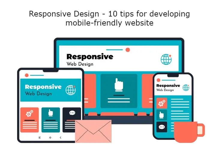
By10 Tips: Responsive Design to Create a Mobile-Friendly Website
1. Why is a mobile-friendly website important?
Creating a mobile-friendly website has become very important these days as people now access more sites from their mobile devices.
2. What is Responsive Design?
Responsive design is the design that gives a website the ability to display correctly on different devices.
3. 10 Tips to Create a Mobile-Friendly Website:
1. Select the selected design template: Select the appropriate design template to create a mobile-friendly website that displays correctly on mobile.
2. Select a simple layout: Select a simple and clear layout so that the site can be easily understood on mobile.
3. Change the font and text size: Change the font and text size to appear correctly on smaller screens.
4. Select the right size of buttons: Select large-sized buttons so that they can be easily pressed on the mobile.
5. Optimize images: Optimize images to display properly on smaller screens.
6. Collapse message for mobile: Collapse messages on mobile devices so users can read easily.
7. Get the clickable links right: Use larger clickable links so they are easier to press on mobile.
8. Increase mobile website speed: Use caching, compression, and other technical measures to increase mobile website speed
9. Add translation feature: Add a language translation feature to your mobile website so that users of different languages can understand your site.
10. Test and improve: Test and improve your mobile website regularly to provide the best user experience.
Now you have understood what are the tips and technical rules for creating a mobile-friendly website. Update your website and attract more users!